
Do you know that you can employ color wheel to help choose fabric color? Color wheel is an important element to dressmaking as it shows how colors relate to each other and visually demonstrates the relationship between primary, secondary, and tertiary colors.
Whether you are looking to find contrast fabric or notions to give a special touch to your garment, using a color wheel saves times and helps you to make the right choice.
What is color wheel in dress making? Color wheel in dress making is an illustrative model of color hues around a circle to help make it easier to select color for fabric.
The color wheel consists of primary (blue, red, yellow), secondary (green, orange, violet), and tertiary colors (combination of primary and secondary colors). This helps to set a guideline to mix, combine, or manipulate colors when choosing color for making garments.
In order to use color wheels in dressmaking, it’s important to understand basic color theory to mix and match fabric when sewing a garment. Start with analogous colors, which are colors that are next to each other on the color wheel and share the common hue, these are perfect color options to start building your DIY wardrobe.
When it comes to selecting fabric to sew, it is important to know which thread color matches the self fabric. Furthermore, if the garment requires contrast fabric or notions, it can take extra time to come up with the right match.
If you have never tried the color wheel and seeking to know more about this tool, then this is the article you have been searching for. Answered below are frequently asked questions about using a color wheel to make a dress, and the best way to choose the right colors for the garment.
What is a color wheel for sewing and why is it useful
A color wheel is a tool or chart that helps people contemplate the relationship between colors, hence why it has been employed in different disciplines for quite some time. Using a color wheel for sewing can be very helpful in choosing the best color combination for your any sewing project.
The color wheel consists of 12 colors designed to guide people in logical fabrics if they are not sure about the right color to select. Based on the shade of color choices, the blue color could be referred to as cyan and reddish tone as magenta.
The good thing about the color wheel is that it opens the door to color sections that will help you view the fabric more easily. It is effortless to use in your project and no extra markings and writings land your way.
The 12 colors are categorized into three; primary, secondary, and tertiary colors:
- Primary colors include yellow, red, and blue. This option is evenly separated around the chart with three other colors added between them.
- Secondary color options occur due to blending the three primary colors, resulting in orange, green, and purple, which are also evenly spaced around the chart. Blending blue and yellow colors results green, and this still applies when selecting fabric.
- Tertiary color options result from mixing secondary and primary colors, leading to six tertiary colors. The tertiary colors can be red-purple, yellow-green, blue-green, red-orange, yellow-orange, and blue-purple. These six colors create a hexagon structure when linked on the color wheel.
Using color wheel helps you to get to learn color relationships and explore your own color preferences based on likes and dislikes. It’s a great practice to make a list of colors or color combination that you like so you can easily use these options in your upcoming sewing projects.
What is the importance of color in dressmaking?
Color in dressmaking is critical in the sense that it makes objects or fabrics more attractive, appealing, and provides a pleasure of observation.
In simple terms, color is the number one reason why individuals get allured to purchase certain clothing. A shirt in a unique color can assist in changing your look year after year.
Studying color is challenging and encompasses vision, light, and pigment, not to mention the technology, science, and the art involved. Furthermore, colored clothing behaves uniquely compared to colored light.
Despite having several color models and classifications, the color wheel system is popularly employed and approved to describe color properties and color pigments that rhyme with the dress.
All pigments and properties stress the three color systems: analyses intensity, color-hue, and value:
- Intensity references the dullness or brightness.
- Color-hue is the name.
- Value is the darkness or lightness.
What does the color wheel represent?
The color wheel represents the relationship between the color levels including primary, secondary, and tertiary. This relationship helps exhibit the color temperature.
To help you understand better the color wheel, the chart uses 12 colors, that can be interpreted as follows:
- Primary color: Comprises three colors including yellow, red, and blue.
- Secondary color: Another range of three colors that include green, orange, and violet.
- Tertiary color: This is formed by mixing secondary and primary colors to form colors like red-orange, yellow-green, blue-violet, yellow-orange, blue-green, and red-violet.
Larger color wheels add more tertiary colors, making it 24 colors in total. Doing this makes some color wheel exhibit interior circles and points, representing what are called color mixtures.
Color Combination Chart for Fabrics
When it comes to looking for color combination idea for fabrics to use in your upcoming sewing projects, understand that there are cool and warm color groups that can determine the overall mood. Based on the style and season, select the color scheme accordingly.
The color combination chart for fabrics are diversified by using color temperature.The cool colors can be found on the green side of the chart while warm colors can be found on the red side of the chart.
Other colors can be considered relative, which implies that colors on the cool end can be warm and vice versa. However, this interchangeable perception relies on how the neighboring color relates to them.
For example, colors from similar hues can still be cooler or warmer than one another.
Simply put, color temperature influences both our perception and psychology by assisting us to evaluate how fabrics look positioned. Let’s evaluate the difference between the cool and warm colors to further understand details on this chart.
Cool colors
Cool colors encompass blue, green, and purple, which can also be varying in intensity and value.
The blue color is the main primary color in the chart. Green can embrace some yellow traits and purple takes those of red.
If you look at cool colors closely, they remind you of water, sky, ice, or snow. That is why they are great colors for a summer wardrobe.
Warm colors
Warm colors can be orange, red, and yellow, and can also be variations of the three. Yellow and red are the main color, while orange color appears to be diminishing in the middle.
Generally, warm colors make you think of warm sunlight or heat visually. Create a cozy and casual look by using a combination of warm colors.
Tips to use the color wheel in dressmaking
Using a color wheel in dressmaking is critical. Despite that, you need to understand the basics of matching and mixing outfits from your wardrobe before getting started.
Here are the tips to help you use the chart to apply information from a color wheel in dressmaking:
- Try analogous colors first. These are colors close to each other on the chart and have the same hue. When trying a new color, look for one that makes you feel safe, for instance light blue. You can find blue between the blue-violet and the teal. In case you fancy light blue, include blue-violet or teal for a palette color.
- Consider complementary colors. These are colors opposite to each other on the chart and bring an amazing power clash. Consider burgundy and forest green or chartreuse and fuchsia. When making a bold color option, remember that both choices stand out.
- Blend neutral colors. Neutral colors are the ground for mixing with brighter colors; however you can still use them together. Do not be deceived that color blending is about bold colors. Neutral colors such as brown, navy blue, black, and white can pair very well.
When dressmaking, a color wheel is an invaluable visual tool to help a sewer put together color combination that look pleasing to the eye. From fabric to notions, the color combinations are called color harmonies or schemes.
In order to select the color, start with an analogous combination of 3 to 5 colors that sit side by side on the color wheel. Then, use colors directly opposite of each other on the wheel.
To make the garment modern and classic, add in neutral color to give a final touch. Once you understand the basics of a color wheel, you will be more confident in pairing colors that you may have previously been hesitant to put together.


Dressmaking Color Wheel: Final Thoughts
The color wheel is a great inclusion in dressmaking. It helps you to select contrast fabric or thread color to create accent design detail that will always help create attractive clothes.
A color wheel is designed as a circle with color hues to help coordinate fabric colors that pair well together. A color wheel consists of primary, secondary, and tertiary colors that help to set, mix, combine, or manipulate when making a garment.
The primary colors are evenly distributed around the chart with three other colors included between them.
Primary colors include yellow, red, and blue. The secondary color is also evenly spaced out around the chart, and are actually a blend of the three primary color to make orange, green, and purple.
The tertiary color is mixture of secondary and primary color. As a result, there are most commonly 6 tertiary colors, but some larger color wheels include 18 tertiary colors.
In general, there are cool and warm colors that divide and indicate the mood of the garment. Depending on the silhouette and season, selecting the right color is crucial.
As beginner, I highly recommend to have a color wheel to use for sewing garments and selecting colors that work well together. Just don’t select colors blindly, have this chart and make use of it to effortlessly blend, match and integrate fun color combinations into your dresses.
Trendy, Affordable Sewing Patterns for All Sizes
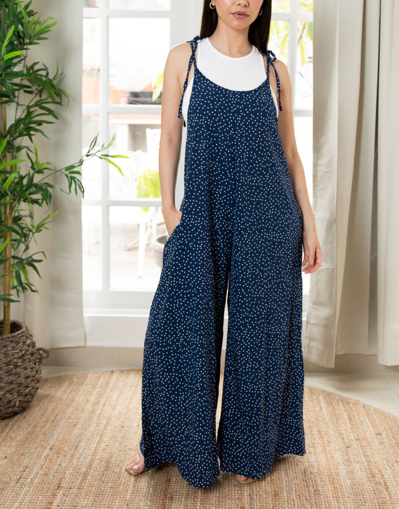
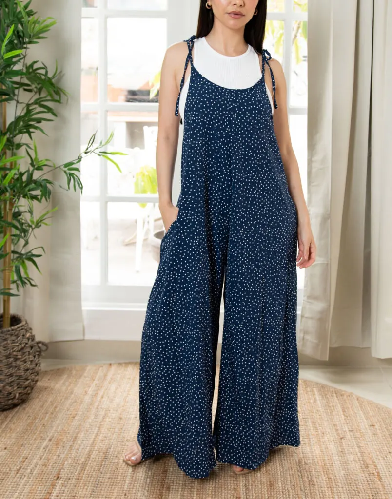
Tie Shoulder Jumpsuit Pattern
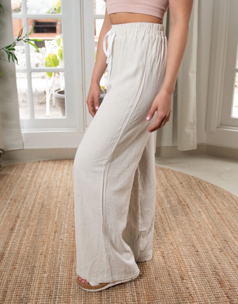

Palazzo Pants Sewing Pattern

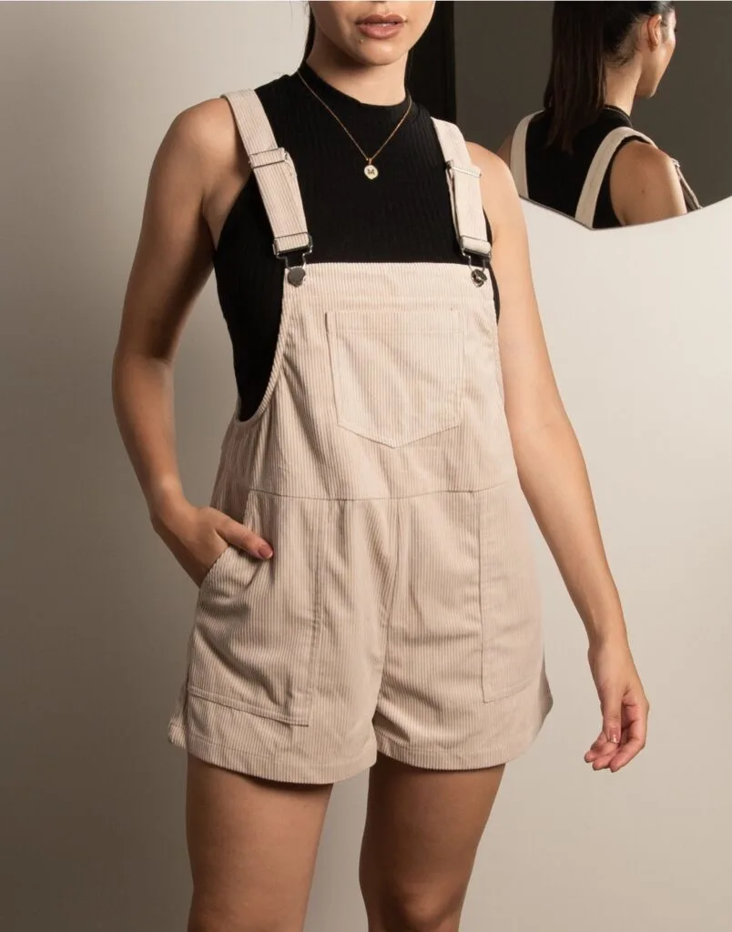
Pocket Overall Romper Pattern
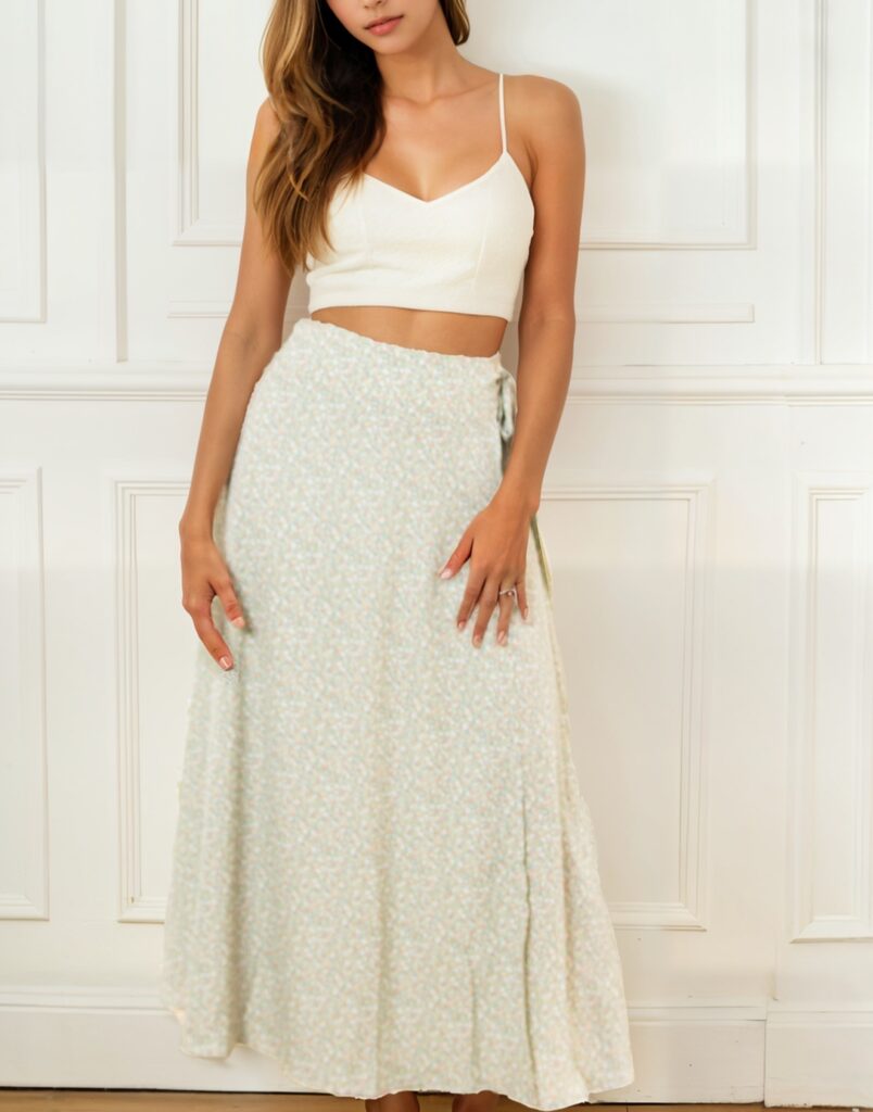

Wrap Maxi Skirt Sewing Pattern
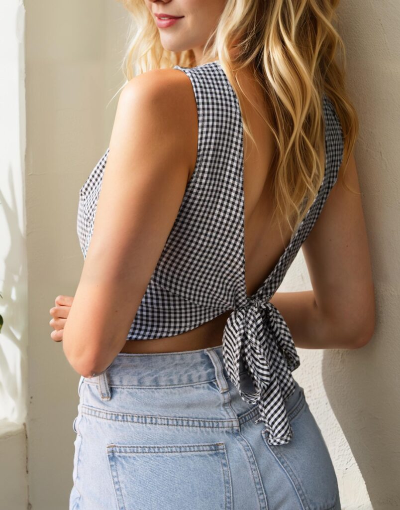

Tie Back Top Sewing Pattern
An/dres
Monday 29th of November 2021
This is so informative. I like the dressmaking color wheel information.